Web Design
Web Design is a full year class open to all students. Students learn about the fundamentals of web design coding and layout while researching and applying the usability principles.

0 Comments
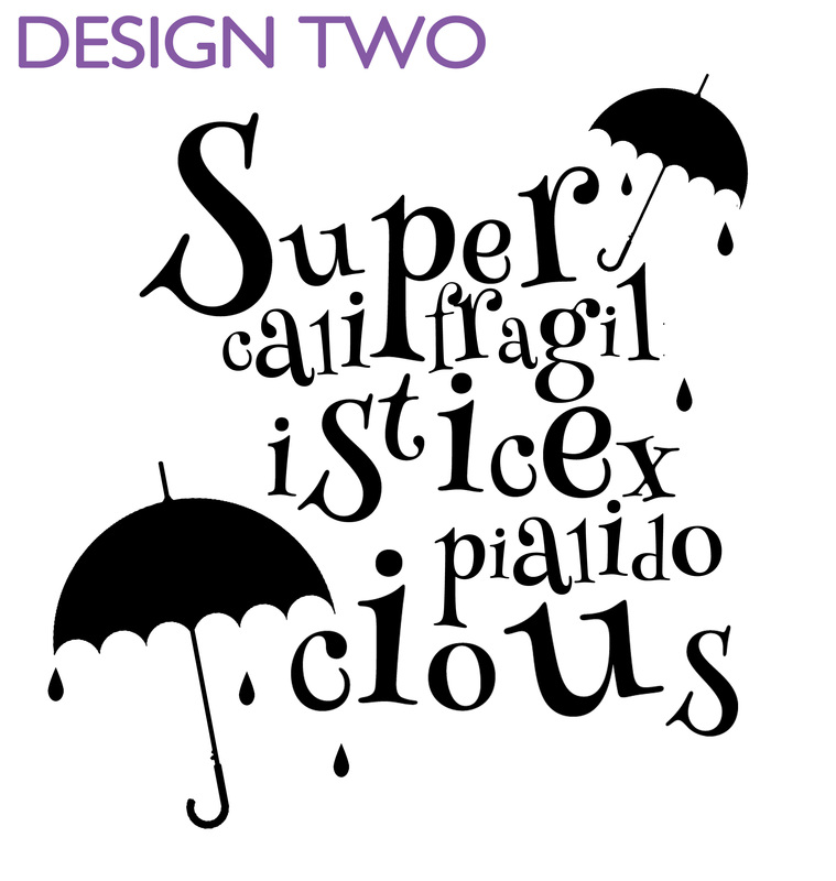
Supercalifragilisticexpialidocious
Lyrics by the Sherman Brothers, 1964 From the Musical, Mary Poppins Originally performed by Julie Andrews and Dick Van Dyke It's supercalifragilisticexpialidocious Even though the sound of it is something quite atrocious If you say it loud enough, you'll always sound precocious Supercalifragilisticexpialidocious Um diddle, diddle diddle, um diddle ay Um diddle, diddle diddle, um diddle ay Um diddle, diddle diddle, um diddle ay Um diddle, diddle diddle, um diddle ay Because I was afraid to speak When I was just a lad My father gave me nose a tweak And told me I was bad But then one day I learned a word That saved me achin' nose The biggest word I ever heard And this is how it goes, oh Supercalifragilisticexpialidocious Even though the sound of it is something quite atrocious If you say it loud enough, you'll always sound precocious Supercalifragilisticexpialidocious  Tips for a Successful Logo:
Vocabulary:
Grading Criteria:
Resources
Grading Rubric:
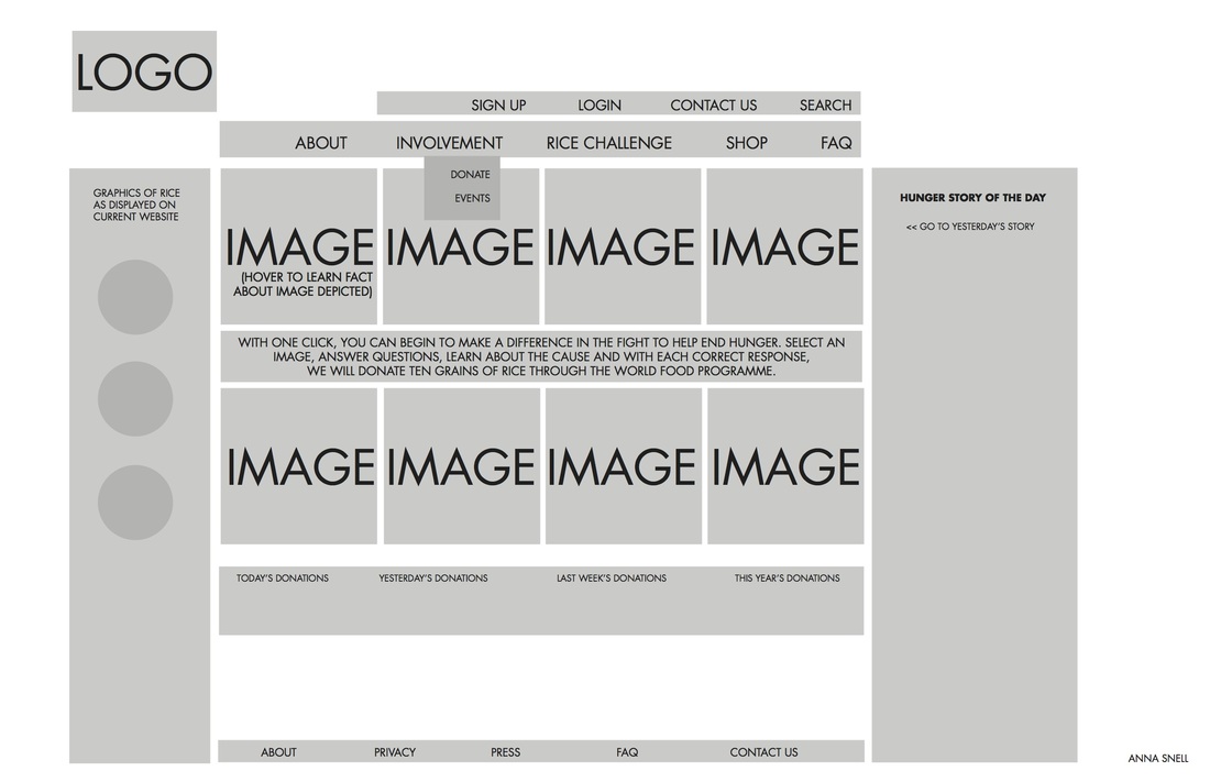
A: Your site page is unique and innovative, bringing the artist and his/her style into the 21st century. You have utilized the elements and principles and all of the skills we have learned so far this year. Craftsmanship is impeccable on the poster. There are no missing elements. The critique is thoughtful, well written, and use the elements of art and principles of design. Poster board uses the elements/principles to create a pleasing composition. Printouts are similar sizes and work well on the poster. B: Your site page is done well; it follows the directions. Craftsmanship on the whole, looks professional, but lacks a few details. There are no missing elements on the poster. The critique lacks some element described above. Poster board is a pleasing composition. C: The site page follows directions, but doesn't utilize the elements & principles very well. Craftsmanship is average. There are 1 or 2 missing elements on the poster. Critique lacks thought and analysis. Poster board uses the elements/principles to create a pleasing composition. Printouts are similar sizes and work well on the poster. D: Your site page lacks creative design. Little effort was put forth into both the poster board. It lacks professionalism and creativity and does not contain many of the required elements. F: No work submitted or work is extremely unfinished and unprofessional. 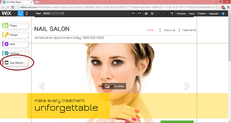 Background
The Internet is a central hub of business and networking, making it almost impossible to navigate a successful career without having a website. Many web designers have created easy web editors to create a professional and usable site without the hassle of coding. We will be using WIX to create a site for a client, using information that you have gathered from the client. You must be able to interact with your client professionally (through email or telephone). Assignment 1. Research WIX and WEEBLY. Write down 3 pros and cons of each. If you need to, create accounts for each in order to get a better understanding of how they work. 2. Sign up for an account at Wix.com or Weebly.com with your personal email address and a standard password. *When you pass this site onto your client, you must give them the password and you will change the email address login. 3. Start creating! ***Do not leave any template pages -- there should be no extraneous information or pages left from the original template. The template is only a beginning layout -- you should change the majority of images, colors, and many other elements. 4. Be sure to keep your client informed of your progress. A successful web designer stays in touch with his/her client and answers all emails promptly (even just to say "Yes, I received your email and I will respond as soon as possible.") Grading Criteria Participation (individually and in the group) Level of Professionalism Exhibited Quality of Website Creativity & Design *No spelling or grammar errors 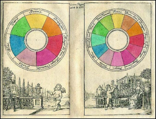 Background
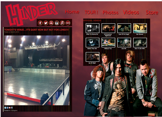
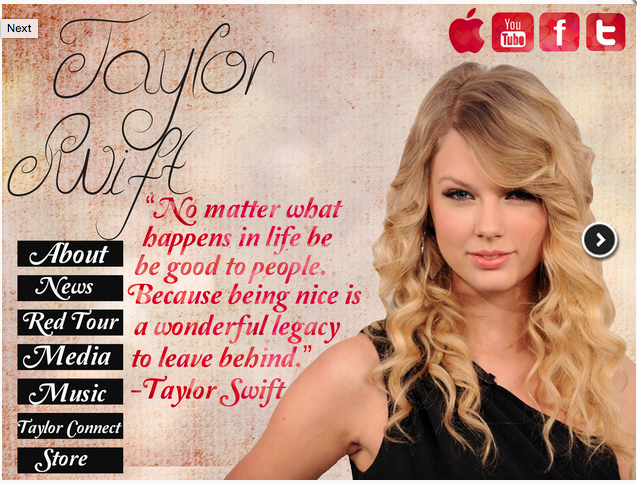
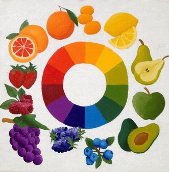
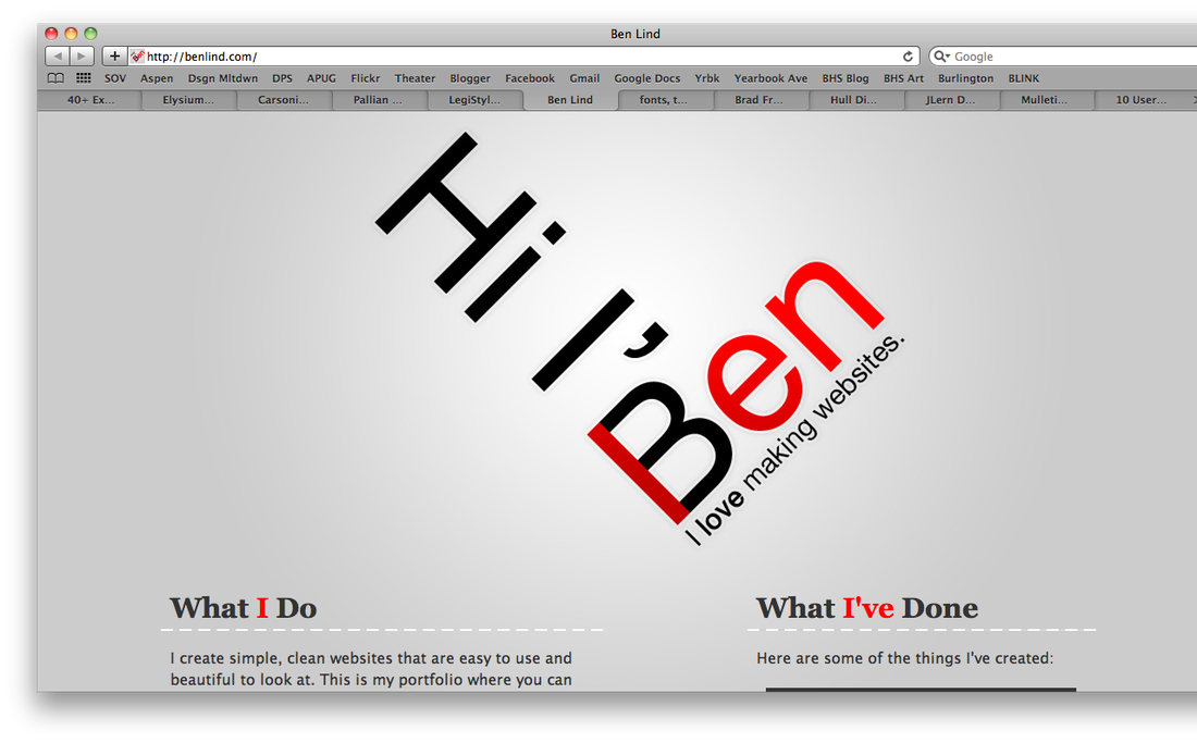
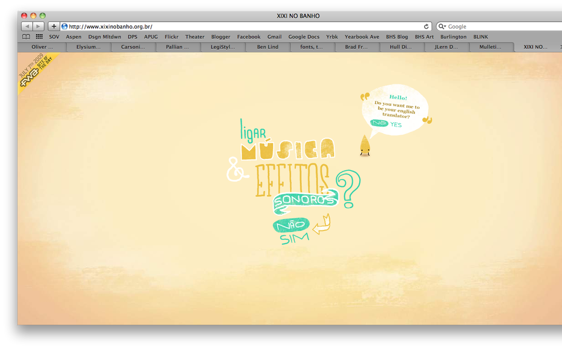
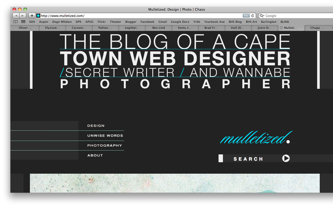
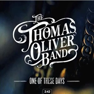
We have studied the principles to create interesting typography using varieties of fonts and sizes. We have also learned the psychology of color and color theory. Now we must put those together to create a unique and interesting site. Assignment Your assignment is to create 2 different versions of the same homepage for a band or musical artist. Making different versions of a site is a common practice for web designers. The reason is to show a client multiple versions of a site to get a sense of what he/she gravitates toward. Specs
Things to Remember
Grading Criteria
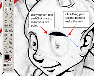
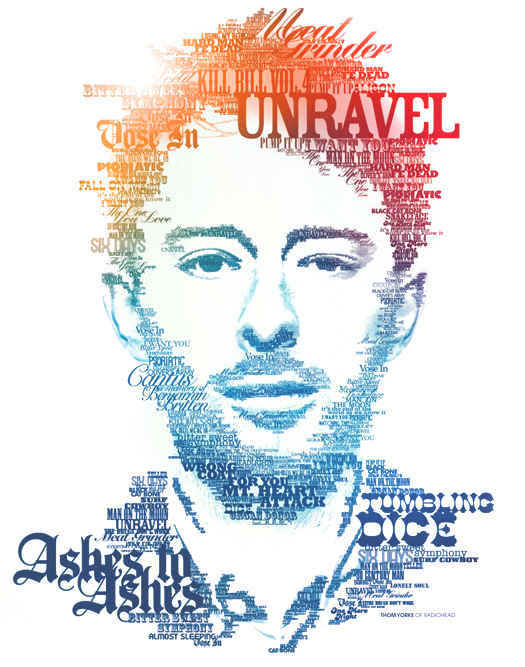
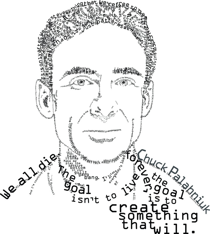
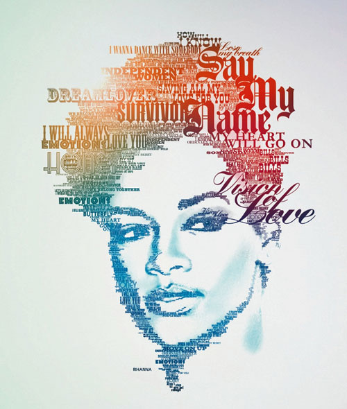
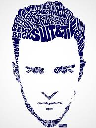
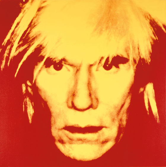
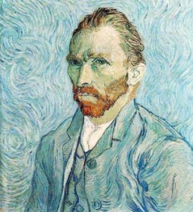
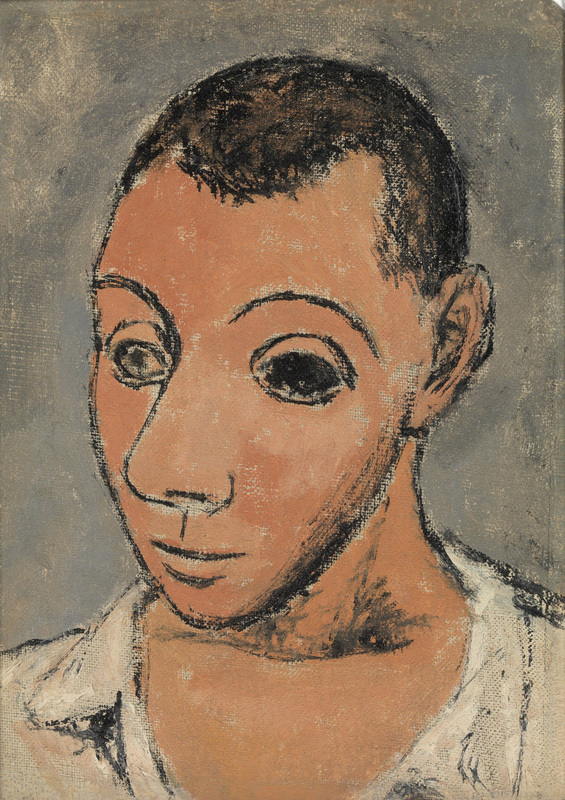
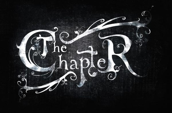
Resources How to Master Color Theory Color Theory for Web Designers 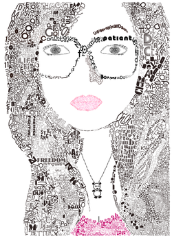 Background: Self-portraits are an important part of art history. Artists have drawn themselves many times to practice painting and drawing. Leonardo da Vinci, Vincent Van Gogh, and Andy Warhol are a few of the many artists who have created portraits of themselves. Typography is an important part of web design. Choosing fonts correctly should define you as a professional web designer. This project will help you to manipulate font. Project: You are tasked with creating a portrait using only letters. You will first take a photograph of yourself (using natural light), manipulate it in Photoshop, and then use that photograph to trace over it with letters. Grading Criteria:
Resources: Typography Slideshow 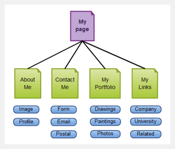 Assignment: Your assignment is to compile all of your work done for Ms. Snell into a convenient Powerpoint presentation and poster board. Both the Powerpoint and the poster board are 50% of your grade. You must be present for the midyear for the entire period. We will do a critique during class where you will be required to present the poster to your classmates. 50% The Powerpoint presentation must include the following:
50% The Poster board must include the following:
Grading Rubric: A: Craftsmanship is impeccable both digitally and on the postern. There are no missing elements on the poster or the Powerpoint. The critique is thoughtful, well written, and use the elements of art and principles of design. Poster board uses the elements/principles to create a pleasing composition. Printouts are similar sizes and work well on the poster. B: Craftsmanship on the whole, looks professional, but lacks a few details. There are no missing elements on the poster or Powerpoint. The critique lacks some element described above. Poster board is a pleasing composition. C: Craftsmanship is average. There is 1 or 2 missing elements on the poster or the Powerpoint. Critique lacks thought and analysis. Poster board uses the elements/principles to create a pleasing composition. Printouts are similar sizes and work well on the poster. D: Little effort was put forth into both the Powerpoint and poster board. It lacks professionalism and creativity and does not contain many of the required elements. F: No work submitted or work is extremely unfinished and unprofessional. |